In 2025, subtitles are everywhere.
What…You don’t believe it? 🤔
Ask 5 of your friends about their behavior while watching a film, a YouTube video, or a TikTok video. You’ll realize that ⅘ are watching them while reading subtitles. They are a necessity for every audio piece you’ll watch.
Font for subtitles began with films and are now revolutionizing social media video formats.
Where do subtitles come from historically? How did they evolve over the past few decades? And what are the best closed-caption fonts for your shorts and long-form videos in 2025? This is what you will learn in this article. 🍿
Note: if you want to add subtitles with amazing royalty free fonts to your video, Submagic’s subtitle generator makes it easy!
2025 UPDATE: In April 2025, we took the font data from 2,000,000 videos to determine which fonts are the most used for online communication. Read our top 15 to find out!👨🔬
{{cta-richtext}}
15 Best Fonts For Subtitles And Captions
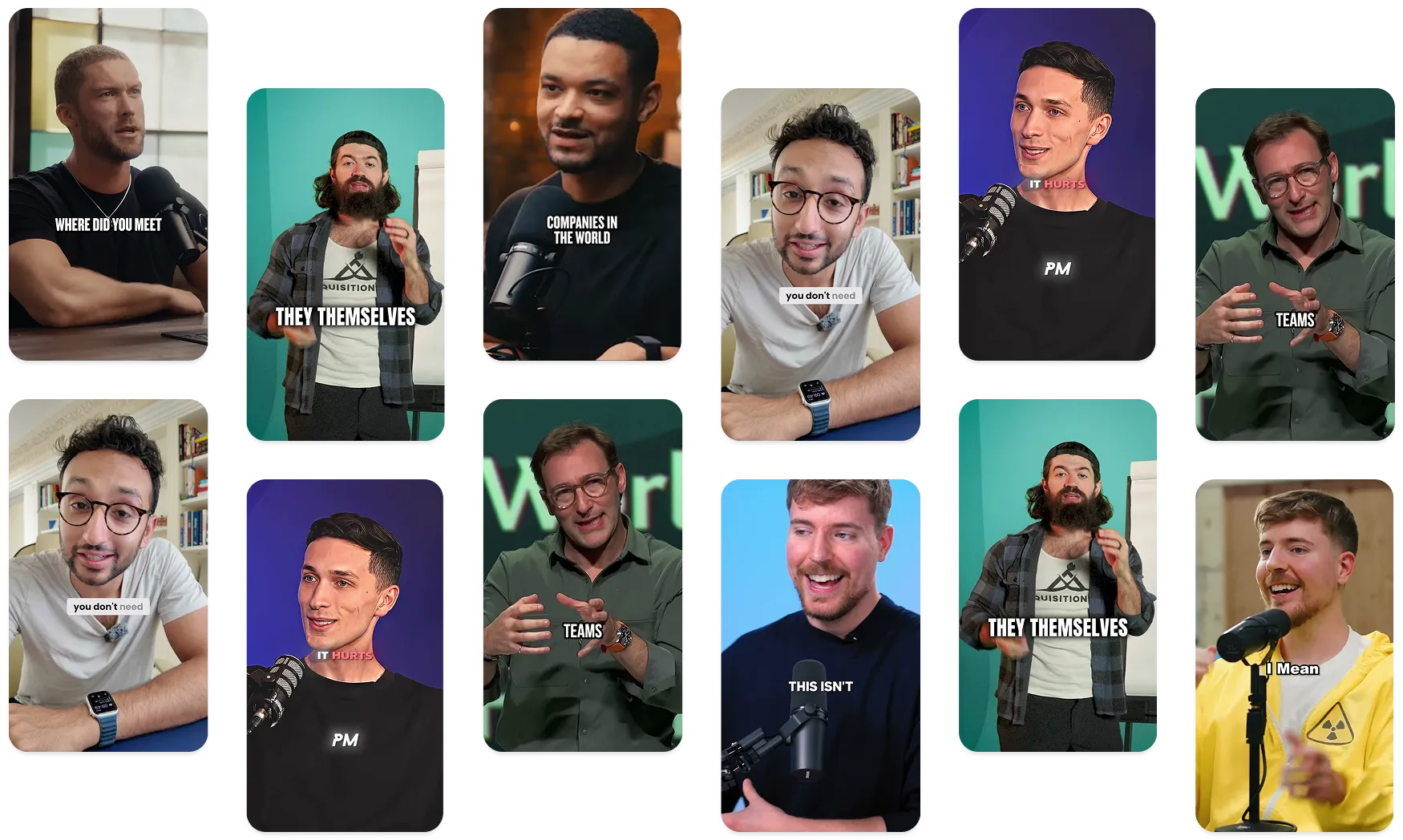
You have many lists and articles on the fonts you should use for your videos. But, in the end, these tops are mostly about perception.
So, At Submagic, we decided to create our font reports not only based on perception but also on real data from a sample of videos exported in our AI video editor.
Here are the results, analyzing 2 million videos (TikTok, Reels, YouTube videos).
Excel Sheet Overviewing Subtitle Font Data Analysis Based on 2 Million Videos1- Montserrat: Best Subtitle Font Overall
👉 Used on 61% of videos
Montserrat FontHave you ever wondered which font Alex Hormozi uses in his videos? You have your answer now. This is in Montserrat font. This minimalistic font is now used by millions of creators every day to enhance their videos.🧡
Widely favored for subtitles and captions in short videos, the Montserrat font, designed by Julieta Ulanovsky in 2010, emerged as a contemporary alternative to Helvetica. Fun fact: this font was inspired by the signage and lettering of the Montserrat neighborhood in Buenos Aires, Argentina. Yes, Montserrat was a neighborhood before being known as a font!
The Montserrat font family includes styles like Montserrat Regular, Montserrat Bold, and Montserrat Italic.
What makes Montserrat's closed-caption font different?
Montserrat Bold in uppercase is an excellent selection for improving your short videos with a touch of modernity. The Montserrat bold font carries modern aesthetics. It can complement the visual style while still delivering impactful information. Montserrat Bold can visually match every theme and niche easily.
The best practice is to choose Montserrat Bold and put your subtitles in lowercase for better engagement!
2- Rubik: Best Caption Font For Videos With Punchy Messages
👉 Used on 7.94% of videos
The Rubik family includes styles like Rubik Light, Rubik Light Italic, Rubik Regular, and Rubik Italic, designed by Philipp Hubert and Sebastian Fischer for a Google-commissioned Rubik's Cube exhibition.
The Montserrat font family includes styles like Montserrat Regular, Montserrat Bold, and Montserrat Italic.
What makes Rubik’s subtitle font different?
Rubik is an ideal choice for subtitles in videos with bold and impactful messages. Its neutral tone ensures clarity without distraction. Rubik's font, in uppercase and bold, is part of the best practices for delivering punchy content that captures attention instantly.
3- Fira Sans Condensed: Best Royalty Free Font For Fitness Videos
👉 Used on 6.50% of videos
Fira Sans Condensed Font for Subtitles
The Fira font family provides versatility and flexibility for various design needs. Plus, the package includes a Mono Spaced variant to improve the usability of your videos.
The Fira font family offers a diverse range of styles, including Fira Sans Condensed and Fira Sans Regular, among others.
What makes Fira Sans Condensed’s subtitle font different?
Fira Sans Condensed is an excellent choice for subtitles, particularly for videos requiring a modern aesthetic. This font is well-suited for sports, fitness videos, and business-related content, where concise and impactful messaging is crucial. When used in uppercase and bold, Fira Sans Condensed enhances the visual impact of captions, ensuring they stand out effectively in videos.
4- Gabarito: Good Subtitle Font For Fitness Shorts and TikTok
👉 Used on 6.25% of videos
Gabarito Subtitle FontOriginally developed for an online learning platform in Brazil, Gabarito font shines in motivational videos with deep messages, creating a mysterious atmosphere that captivates viewers. Its design incorporates high-school level symbols and figures while maintaining a friendly and engaging tone.
Gabarito offers six weights from Regular to Black.
What makes Gabarito’s subtitle font different?
Gabarito's design makes it perfect for subtitles in videos with motivational content. According to the subtitle design we created with this font, it's always better to add some brightness to your subtitles, with your text in uppercase.
5- Poppins: Best Caption Font For Educational Videos
👉 Used on 5.05% of videos
Poppins Subtitle FontPoppins is a famous royalty-free font, used 7.3 billion times in average, every week. Renowned for its good readability, Poppins has become a must-choose free font for videos uploaded online.
Poppins offers a range of styles including Bold, ExtraBold, and Italic. This makes it adaptable to different design needs.
What makes Poppins subtitle font different?
Poppins' font make it an excellent choice for subtitles in educational videos. When used in lowercase and with multiple subtitle line characters, it ensures a top-notch comprehension for viewers, on topics that need a high-concentration.
6- DM Serif Display: Best Video Font For Storytelling
👉 Used on 3.07% of videos
DM Serif Display FontDM Serif Display was designed for large poster, its elegant design ensures optimal readability and visual impact.
Bonus: When paired with its italic option, DM Serif Display adds an extra layer of style and sophistication to the narrative.
What makes DM Serif Display’s subtitle font different?
DM Serif Display's makes it perfect for captions in storytelling videos. Whether used for horror, mysterious, or joyful stories, its elegant design enhances the visual storytelling experience.
7- Opinion: Best Subtitle Font For Facecam Videos
👉 Used on 2.96% of videos
Opinion Pro FontMint Type's Opinion Pro is a free geometric sans-serif font designed to meet diverse typographic needs. And believe me or not, but I wish I knew this font earlier for my videos.
What makes Opinion’s subtitle font different?
Opinion Pro, particularly in its Extra Condensed variation, stands out as an ideal choice for facecam videos, especially in niches like real estate. Its rigid curves and pronounced vertical stems lend it a professional and sophisticated appearance, making it perfect for both display and paragraph text.
8- Circular: Good Font For Videos With Strong Visuals
👉 Used on 2.27% of videos
Circular closed captions fontLL Circular, designed by Laurenz Brunner, is a sans-serif font family. LL Circular represents a fresh interpretation of the grotesk genre. Fun fact: It took 5 years of conception to release this font!
LL Circular offers a diverse range of styles, including Circular ExtraBlack, Medium, Italic, and Bold.
What makes Circular’s caption font different?
LL Circular make it an ideal choice for videos with strong visuals. Its lowercase circular font style is particularly effective for videos where you want viewers to focus on important footage rather than subtitles. Also, in can work well for professionnal videos, but stay until the end; there is a better royalty-free font for this type of video!
9- Roboto: Best Font For Health Videos
👉 Used on 1.34% of videos
Roboto subtitle fontRoboto is a font is one of the best and soft fonts you can find online. Unlike some grotesks that distort their letterforms to impose another atmosphere, Roboto maintains a natural design!
The Roboto font family includes variations such as Roboto Bold, Roboto Black 900, and Roboto Medium.
What makes Roboto’s closed-caption font different?
Roboto makes it an excellent choice for health videos, particularly for doctors, dentists, or other medical professionals. This font and its readability can improve concentration and comprehension of your audience since you can use complex and uncommon words.
10- Arial: Good Caption Font For Professional Videos
👉 <1.5%
Arial FontWidely chosen for subtitles and captions in short videos, the Arial font maintains a historical link with the Helvetica font. Created by Monotype in 1982, Arial emerged as an accessible alternative to Helvetica, broadening access to clear typography. 📝
The diverse Arial font family gathers styles like Arial Regular, Arial Bold, and Arial Italic.
What makes Arial’s subtitle font different?
This royalty-free font is an excellent choice for concise, professional, and information-rich videos. If you explain something complex in your video, the Arial font in lowercase is definitely the greatest choice. In fact, Arial’s simplicity won’t distract your viewer’s attention. Consequently, they will be more focused on your message, and less on graphics. Whether you're creating educational content, business presentations, online tutorials, or any video that requires delivering complex concepts, Arial's clarity ensures that your information is presented in an easy-to-understand manner.
11- THE BOLD FONT: Best Font for Impactful Messages in Your Shorts and TikToks.
👉 <1.5%
The Bold FontThe Bold Font, designed by Sven Pels, creates a strong and impactful visual presence that sets it apart from traditional subtitles. The Bold Font and condensed design make it an excellent choice for creating attention-grabbing videos. 👀
When aiming to make a bold statement and tell your message with a convincing feeling in your short videos, The Bold Font is an amazing choice. The Bold Font commands attention with its shapes, making it perfect for videos with profound and strong messages.
Unlike many other free fonts, The Bold Font font doesn't have a font family!
12- Jomhuria: Best Subtitle Font for Artistic Videos
👉 <1.50%
Jomhurian Regular fontLess known than many other royalty-free fonts for subtitles and captions in short videos, the Jomhuria font has a unique style and impressive precision. Created with an artistic vision, if you post aesthetic videos this is definitely a font you should try. 🏄
No matter the artist you are, this typeface fits well with surf, photography, or even painting niches. You can also use the Jomhuria font for poetry and short-form content with quotes.
The Jomhuria font collection includes variations like Jomhuria Regular, Jomhuria Bold, and Jomhuria Italic.
13- Impact: Best Subtitle Font For Retro and Memes Niches
👉 <1.50%
Impact font{{button-richtext}}
Designed by Jeffrey Lee in 1965, the Impact font has remained popular over the years, especially since the meme culture began to use the Impact font on the Internet in the late 2000s (at the point when at that time memes generators software incorporated the Impact font as the main font). 🔥
Even though this free font isn't as aesthetic as the others on this list, it remains a great choice for memes, Internet history, and video game niches. Also, we can start seeing this font being used for travel and vlog short content! The important guideline to keep in mind if you want to use the Impact font for your subtitles is to keep the number of characters short for each line. It's a quite heavy font. Try to reduce the characters of your words for each subtitle line!
Unlike many other free fonts, the Impact font doesn't have a font family with multiple weights, such as regular, bold, or even italic.
14- Shrikhand: Best Subtitle Font for Fashion, Make-up, and Vlog Videos
👉 <1.5%
Shrikhand fontChosen widely for subtitles and captions in short videos, the Shrikhand font adds a touch of playful nostalgia to your visual content. Designed with a nod to the Y2K movement, Shrikhand brings a retro-futuristic vibe that resonates with the current global trend of embracing Y2K aesthetics. 🗺️
As the Y2K (Year 2K) movement rapidly emerges all around the world, nostalgia has made a strong resurgence. Influenced by the vibrant and futuristic designs of the late 1990s and early 2000s, this movement makes us remember the time when digital innovation was at its peak, and there were no boundaries for creativity.
The Shrikhand font shines particularly in fashion, makeup, and vlog niches. Its vibrant and creative design complements makeup tutorials, beauty product reviews, and DIY projects, adding a touch of energy and originality to these videos. Also, we could see a perfect match with the vintage niche!
15- Cocogoose: Best Font for Masterclass and Podcast Videos
👉 <1.5%
CocoGoose fontCreated by Zetafonts in 2013, the CocoGoose font introduces us to a unique and original visual identity that completely distinguishes it from conventional royalty-free fonts. It's a great choice for distinctive video content with a convincing and professional message.🎙️
That's why you could use CocoGoose Bold in lowercase for any videos where you share a story, a personal experience, or a historical event. Editors frequently use this font to create a multitude of shorts, utilizing long-form videos such as masterclasses and podcasts, all with the CocoGoose font.
The CocoGoose royalty-free font family encompasses styles like CocoGoose Regular, CocoGoose Bold, and CocoGoose Italic.
Which Font Should I Use to Stand Out From the Competition?
The best font for captions on my socials
The choice of your subtitle font should remain consistent across all your different platforms. Try to understand your brand and the message you want to give to people. But, do not forget your viewers' preferences.
Understand the visual trend there is currently in your niche because this is what your viewers will like to see. There is a mix to do between your brand message and your niche's trend. But, if you have the same font as the majority of competitors, don't worry! It's not only about the font...
Is it only about the font?
When it comes to differentiating yourself from the visual aspect of your videos, it is not only about the font, especially when you use royalty-free fonts. Here's how you could make a great impression with your visual:
- The font family: For plenty of free fonts, there is a font family. For instance, the Arial font family gathers styles like Arial Regular, Arial Bold, and Arial Italic. So, if everybody is using the same font, why not take a look at its font family?
- Uppercase and lowercase text: The fact that you switch the lowercase font into uppercase totally changes the design of the font. Sometimes you do not have to search for other fonts to change the visual design... simply switch the font from lowercase to uppercase (and vice versa!). 🫡
-The subtitle color: Do you like the font that everybody is using in your niche? No worries, you can make a lasting impression with your subtitle color. Nowadays, the majority of content creators are using the 3 main colors: red, neon green, and neon yellow. You will tell me that there is a reason behind that. Indeed, a study called "A Perceptual Analysis of Standard Safety, Fluorescent, and Neon Colors" has shown that those "were rated the highest on perceived importance". However, viewers are used to this color, so why not change the rules and start aligning your brand color with your subtitle keywords? 🎨
Frequently Asked Questions on the Best Font For Subtitles
What is the font used for memes?
The font is called Impact! This is the one you can see in almost every meme.
What is the YouTube subtitle font?
The font used by Youtube’s captions is called Arial. Check out this article to find more information about this popular Youtube font.
What is the TikTok caption font?
The TikTok caption font is called “TikTok font”! They designed this font specifically for it.
What are the best fonts for YouTube videos?
There are 3 popular fonts for YouTube: Arial, Roboto, and Montserrat. Those are also the 3 best fonts for Reels.
What is the most popular font for videos online?
According to our report analyzing 2 million videos, the most popular font for subtitles is Montserrat (1,200,000 videos out of 2,000,000 use Montserrat!)


.webp)