
Ten angles in one click
Instead of staring at one weak draft, you get ten directions at once: urgent, benefit-led, low-commitment. Keep the closest match and move on.


Describe what you're promoting and get ten ready-to-use CTAs, each action-led, benefit-driven, and short enough to drop into a post, page, or email. Free, no sign-up.

Describe what you're promoting. Optionally add platform and goal.
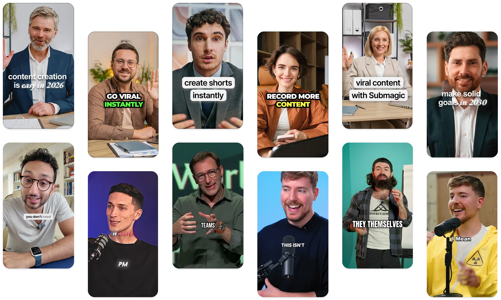
These companies trust and love Submagic AI captions.


A call to action, or CTA, is the line that tells your reader exactly what to do next: download the guide, book a call, start a trial. It turns interest into a single, specific action instead of leaving people to guess.
It is a free tool that writes ready-to-use CTAs from a short description of what you're promoting. You type your context, optionally add a platform and a goal, and it returns ten options you can copy straight into a post, page, or email.
Lead with a verb, name the one action you want, and make the payoff clear: "Grab the free checklist," not "Learn more." Keep it short, write in second person, and match the urgency to the offer. Generate a batch here if you're stuck.
A strong CTA is specific, action-led, and tied to a real benefit. It names what the reader gets and removes friction, so "Start your 7-day trial, no card needed" beats a vague "Sign up." Clarity and a concrete next step matter more than clever wording.
Phrases like "Get started free," "Claim your spot," "Download the guide," "Book a demo," and "Try it today" work because each one pairs a verb with a clear outcome. The generator builds variations like these around your specific offer instead of generic templates.
An action verb, the specific thing the reader gets, and a reason to act now. Strong CTAs often add light urgency or remove a worry ("free," "no card needed," "cancel anytime"). Drop anything vague and keep it to one clear ask.
Yes. The context field is open text, so you can describe anything from a fitness coaching offer to a SaaS trial or a real-estate open house. The more detail you give about the offer and the audience, the more relevant the CTAs come back.
Swap "Buy Now" for something that fits the moment in the journey: "Start free," "See how it works," "Get the bundle," or "Claim your discount." Softer, benefit-led phrasing usually converts better when a reader isn't ready to commit yet.
Put your main CTA where attention peaks: the end of a caption, the close of an email, a button above the fold on a landing page. One clear primary action per view works better than several competing buttons fighting for the click.
Започнете


Submagic е най-добрият инструмент с изкуствен интелект за създаване на завладяващи видеоклипове short-form за секунди за екипи и фирми.